Categories
COVID-19

Thoughts on COVID-19 October 12, 2020

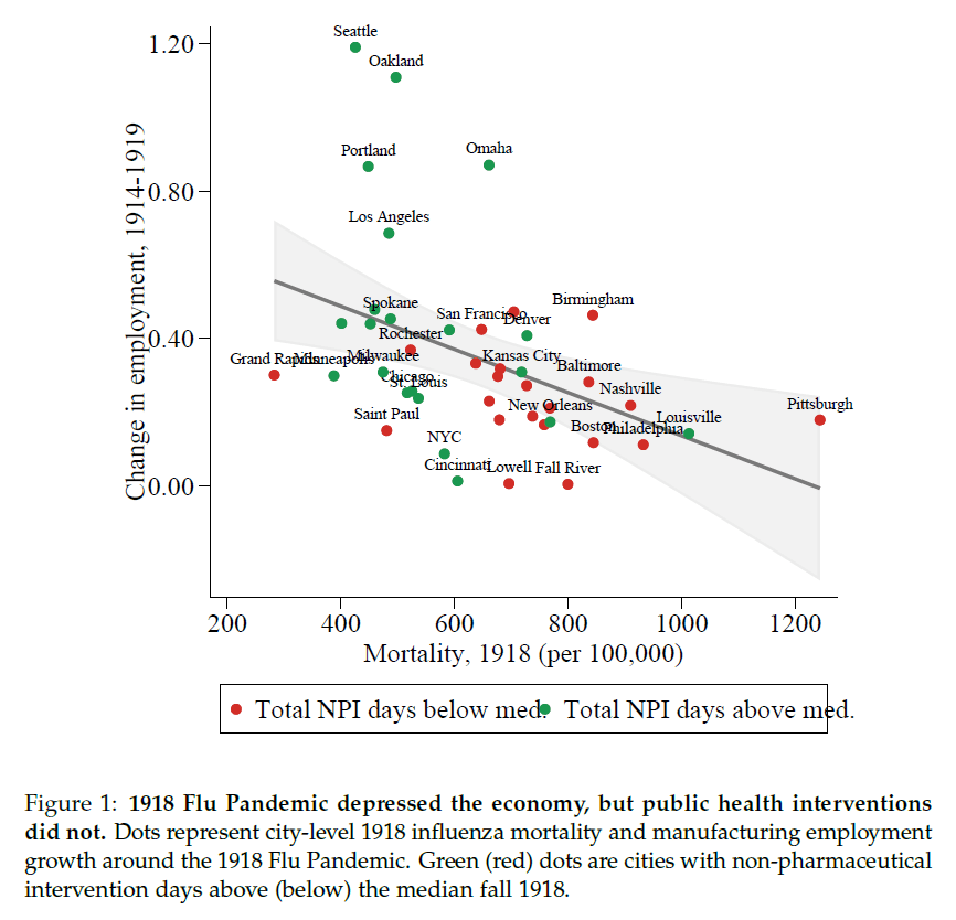
  • Just how many Americans have been exposed to COVID-19 is a difficult number to know with absolute certainty but each day we get closer and closer as serological (antibodies to the virus present in the blood) studies begin to roll in. Many Americans drastically overestimate this number, perhaps as some form of wishful thinking. Current best estimates from ongoing serological studies from the CDC and others puts the positivity rate somewhere around 10% or less nationwide with some regions higher and some lower based on regional disease prevalence to date. Current deaths due to COVID-19 stand at just over 214,000. To obtain herd immunity for COVID-19 we need to reach, at a minimum, 70% of Americans infected. With 214,000 deaths after the first 10% of Americans infected we could expect another one million deaths or more before herd immunity would have any significant protective effect. Even if our ability to treat patients improves enough over time to cut the death rate in half we’d see an additional half a million deaths from a do-nothing approach to the pandemic.
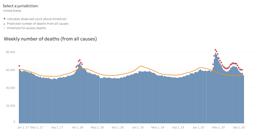
  • COVID-19 denialists hold that deaths due to COVID-19 are over-counted. A few weeks ago they gleefully pointed to a CDC report which revealed that 94% of reported deaths were in people with other health issues. To them, this apparently indicated that only 6% of people had actually died from COVID-19. I’m not going to address the fallacy of that thinking here other than to say that if I have diabetes and while crossing the road I get struck by a bus and die, my cause of death is blunt force trauma–pure and simple. We can’t say that diabetes killed me in this case even if my diabetes made my treatment more difficult and played some role in my demise. Diabetes may very well be listed on my death report; I still died from blunt force trauma. The clearest evidence that denialists are wrong here comes from an examination of excess deaths. Epidemiologist can easily examine the previous five or ten years of deaths to establish a predicted number of deaths for the current year. In 2020, as of mid-September, there were 278,000 excess deaths compared with previous years. At that time (September 19, 2020) there were 199,000 deaths attributed to COVID-19. There are two important points here that invalidate the unscientific thinking of COVID-19 denialists in several ways. First, an accounting of excess deaths isn’t an examination of cause of death. It’s simply this: let’s count deaths from the last few years and then let’s count deaths from this year. Guess what, the number this year is bigger…by quite a bit. Where did all those excess deaths come from? It didn’t come from the soul-crushing inability to go to the gym or a favorite nail salon; it came from people dying after being infected with a novel coronavirus. The second important point form this data is that the evidence points to the fact that we’re undercounting COVID-19 deaths. As of September, there have been 278,000 excess deaths but only 199,000 (currently 214,000) deaths reported as due to COVID-19. That means there are nearly 80,000 extra deaths this year that very likely the majority of those were uncounted COVID-19 deaths.
CDC Weekly Excess Deaths showing significant increase above predicted beginning early 2020 and the observed deaths exceeding those attributed to COVID-19. https://www.cdc.gov/nchs/nvss/vsrr/covid19/excess_deaths.htm#dashboard
  • A report from the CDC shows that Arizona’s institution of mandatory masks significantly reduced transmission of COVID-19 within 2 weeks. A combination of mask mandates and other mitigation strategies (prohibiting large gatherings, temporary closure of bars, gyms and theaters and a reduction in restaurant capacity led to a 75% decline in COVID-19 transmission statewide.

The number of COVID-19 cases stabilized and began to decrease approximately 2 weeks after local officials began mandating mask wearing (throughout several counties and cities) and enhanced sanitation practices

https://www.cdc.gov/mmwr/volumes/69/wr/mm6940e3.htm?s_cid=mm6940e3_w
  • A massive study out of India looking at COVID-19 transmission dynamics is well worth reading. I’m going to focus on two important points from the study in part because of their timeliness. First, the study showed that not all spreaders are equal. Approximately 70% of infected individuals did not demonstrate spread to other contacts. Instead, 8% of positive index cases were responsible for nearly two thirds of contact cases. This supports the growing evidence that super-spreading events such as the White House Rose Garden SCOTUS event play an extremely import role in disease spread and underscores the importance of social distancing, mask wear and restricting large groups. The second point I want to highlight from the Indian study shows that children spread the virus at similar rates as seen in adults. The study was unable to examine spread from children to adults but it did show that infected children spread the disease to 18% of their peers. This of course has significant implications for the reopening of schools across the country. As I’ve stated before, to safely reopen schools disease prevalence in the overall community must be very low and testing must be widespread with quick results to allow for rapid isolation of positives and contacts and comprehensive contact tracing. This kind of low community rate comes from grown-ups strictly adhering to non-pharmaceutical interventions such as but not limited to full adherence to mask-wearing and the avoidance of congregating in group settings.
Categories
COVID-19

Comparing COVID-19 to the Flu, Again

Beth Israel Deaconess Hospital, Boston MA — Tim Pierce / CC BY (https://creativecommons.org/licenses/by/3.0)

Early in the COVID-19 pandemic there was much wishful, and perhaps to some degree magical thinking crying out that COVID-19 is “no worse than Flu!” Sadly and defying all logic and science, the cry remains prevalent today.

For those that care about numbers a recent pre-print article looks at the experience at one tertiary care center and compares several months of COVID-19 with five, count em’, five years of influenza patients. Bear in mind that this study has yet to undergo peer review but given the straight-forward nature of the comparative data I think it unlikely the results will change after publication.

Beth-Israel Deaconess Hospital in Boston looked closely at their COVID-19 patients who were admitted in March and April of 2020 and compared various metrics like ventilator use, vasopressor support (medications that keep heart output and blood pressure from dropping to fatal levels), renal replacement therapy (e.g. dialysis), ICU admission rate and death rate to influenza-positive patients who had been admitted over the previous five years.

From 2014-2019 there were 1052 patients admitted with Influenza. Compare that to 583 COVID-19 positive patients admitted in just the first two months of the pandemic. The average number of flu patients admitted over the typical 8 month season was 210, a total rapidly outstripped by the COVID-19 pandemic. The likelihood of requiring mechanical ventilation for flu patients was 8%, but the likelihood of being placed on a ventilator for patients with COVID-19-related respiratory failure was 31%. Over two months of 2020 174 COVID-19 patients were placed on ventilators compared with a total of only 84 influenza patients over the previous five years combined! The mortality for Influenza patients over the study’s five years was 3% compared with a 20% mortality for COVID-19 patients. Importantly, the percentage of patients without a pre-existing condition was higher for COVID-19 patients (20%) than for Influenza patients (4%) indicating that COVID-19 affects more healthy people than does Influenza.

I’ve posted a number of articles that get to this scientific truth–COVID-19 is more severe and more fatal than influenza. Unless I find particularly compelling data or an ingenious study, I’ll probably not post more on this topic; the data is in and COVID-19 is demonstrably more severe than the flu. Even with overwhelming evidence though, some, plagued by confirmation biases, will continue be data-denialists. They are not new; they have been with us throughout history and sadly they won’t convinced any time soon. You can’t after all, reason a person out of a position they weren’t reasoned into in the first place. To those who value data, this will come as an expected support for a growing mountain of data on COVID-19’s disease burden. The data doesn’t scare us, it informs us and with knowledge, free of dogma or preconceived notions, we will win the war against this very significant threat to human health.

Categories
COVID-19

On Bitter Pills

“The cure can’t be worse than the disease.”

This is a common and somewhat understandable refrain in recent months. Is the damage to the economy caused by public health interventions like social distancing and shelter-in-place worse than the potential damage of COVID-19 itself? Is the cure worse than the disease? How can we know?

“The farther backward you can look, the farther forward you are likely to see.”

Winston Churchill

History can help us if we’re willing to learn from it. Several economists have taken a bite out of this problem with very interesting results. Prof. Emil Verner from the MIT Sloan School of Management along with Dr. Sergio Correia and Dr. Stephan Luck from the Federal Reserve have done what more of us should do–learn from history. Together these economists studied social distancing practices or non-pharmaceutical interventions (NPIs) from the Spanish Flu of 1918 to evaluate the effects of social distancing on the economy. Their paper is not yet peer-reviewed but it provides some compelling insights into the efficacy of public health interventions in a pandemic and the resulting economic impacts.

The 1918 influenza pandemic is thought to have infected nearly a third of the world’s population at the time or 500 million people. In the United States alone, 675,000 people died, worldwide–50 million. It was caused by an H1N1 virus with genes of avian origin. Public health measures at the time were focused on prevention of spread from person to person. Those infected were prevented from breathing the same air as the uninfected. Public health guidelines and interventions at the time included prohibiting mass gatherings, banning non-essential meetings, closing dance halls, bars and cinemas, and some encouraged staggered work times to prevent unnecessary congregation. All pretty familiar stuff today, right? Like today, the degree to which these recommendations were followed varied widely throughout the country.

Policemen in Seattle wearing masks during the 1918 Influenza pandemic/National Archives

What Verner, Correia and Luck found was that, as expected, higher mortality in a region led to greater economic depression. More than that though, they looked at American Cities’ response and compared the economic impact of municipalities who enacted strict social distancing measures with those who enacted much weaker measures. Here they found that cities who enacted the strictest social distancing measures had lower mortality but they also experienced the greatest economic growth. Simply put, cities that were committed to public health measures like social distancing had fewer deaths and better economic outcomes.

The green-dot cities in the upper left who enacted strict NPIs like social distancing over longer periods had lower mortality and higher economic growth whereas the red-dot cities in the lower right, who were more lenient with NPIs, experienced higher mortality and stunted economic growth. The authors say it best.

Comparing cities by the speed and aggressiveness of NPIs, we find that early and forceful NPIs do not worsen the economic downturn. On the contrary, cities that intervened earlier and more aggressively experience a relative increase in manufacturing employment, manufacturing output, and bank assets in 1919, after the end of the pandemic.

Emil Verner, Dr. Sergio Correia and Dr. Stephan Luck/Pandemics Depress the Economy, Public Health Interventions Do Not: Evidence from the 1918 Flu

The economic impacts of this pandemic on families and businesses has been devastating. Public health measures like shelter-in-place and social distancing are a bitter pill to be sure. History tells us, however, that this medicine, while hard to swallow, gives us the best chance of surviving, both medically and economically.

Future generations will study this moment, perhaps as they face their own crisis. Just like us they’ll be looking for clues from the past about how to survive. Will they see ancestors rooted in solid science with an unwavering commitment to public health, or will they see a fleeing from science and reason when things got hard? I’m not sure.

In the end, history will judge.

Categories
COVID-19

Has Riverside County Finally Passed Its COVID-19 Peak

A brief look this morning at some data where I live. Here are some of the data for Riverside County since April 15

Daily New Cases

Daily New Deaths

So looking at a population like Riverside County can be challenging compared to larger centers around the country. There will inevitably be variations in the graphs because of a relatively smaller population and regional reporting characteristics.

What you probably can see is that there appears to be an overall decline in Daily New Cases in Riverside over the last several weeks. Most days in the last week are running under 100 new cases. It’s a general trend and there’s a lot of noise here so it’s difficult to draw any solid conclusions. One thing to note is the odd reporting on April 20. That day there were problems with the State’s data entry tool, CalREDIE. The 22nd made up for that when the system was working better but it’s probably more accurate to average those two days to something more like 122 and 123.

Similarly there appear to be changes in Daily New Deaths, the difference being an increase more recently. Again, all the caveats about sample size and variation are applicable here so we probably need to watch the data a bit longer to know for sure that the trends are true. But an increasing Daily New Death rate with a decreasing Daily New Case rate does tell us something. It’s possible that we’re at or maybe a bit past our peak for this wave of the infection in Riverside County. Typically, the deaths start to go up after peak which makes sense. If you have an increased number of people going into the hospital over a few days, they don’t generally die right away but within a week or two those that are most severe will die–hence, tragically deaths go up even though cases are going down. Further data over the next several weeks will likely tell us one way or the other. I’ll post updates in future days but keep an eye on those numbers. The easiest way to do that I’ve found is STAT’s COVID-19 tracker. You can view down to county level on this tool to monitor Daily New Cases and Daily New Deaths.

One other bit of news for Riverside before I go is that our doubling time has increased to 13 days! That starts to bring us in line with the State which is good news! I remember when we were doubling every 4.6 days and we (public health) longed for a doubling time in the double digits. Seems like a lifetime ago, I think it was a month.

Categories
COVID-19

Thoughts on COVID-19 from a New Home

For some time I’ve been considering leaving Facebook. While there are many positive aspects of the social media giant, there are some things about it that I find hard to stomach. It’s a great place to share photos of family and pets and jiu jitsu, but it’s a terrible place for conversations. The world is polarized and so is Facebook, actually, the world may be polarized because of Facebook. I love to talk science though. Writing about COVID-19, while not a cheery subject, has helped me process some of the feelings I have about living through it, especially as a public health physician, worried father and husband. I just want to do it more on my terms. No yelling, no anti-science comments, just people who want to understand what on earth is happening right now with the best tool the human race has ever devised for understanding our world. So welcome to my new home!

Thoughts on COVID-19

  • Nationally there’s a bit of a worrisome trend with our doubling time. A while back, on Facebook, I mentioned the good news that our national doubling time was increasing and that it was increasing by more than a day, every day. That signifies a peak in terms of new daily cases. The daily increase in doubling time was actually increasing along a sloping curve meaning something approximating an accelerating growth curve. That’s not happening anymore. What we see now is more of a plateauing of our doubling time. It’s been stuck increasing at a rate of about 18-20 hours a day for a week or so–every day our doubling time is increasing by the same amount, 18-20 hours. It’s no longer accelerating. There are a couple reasons for why that might be happening. Some are okay, some are not. It’s possible that regional and state differences in the timing and slope of the COVID-19 curves are making it so that later peaking states are rising while earlier peaking states are waning. That could be okay. It just means we’re all marching to the beat of our own drums and eventually we’ll all start a collective increase in our doubling time rate together. It also could mean that people are slipping with their social distancing and stay-at-home compliance. Spread of infection during recent protests along with religious ceremonies for Easter and Passover could be putting the brakes on our ride away from the peak. More time will tell. For all sorts of great information on the national doubling time, visit https://www.danreichart.com/covid19 He runs one of my favorite statistical sites for COVID-19 and most of my US doubling time information posted to Facebook and now here comes from his great work. His approach is to look at each day anew. Here’s where we are today and this is what we’ll look like in the future if our doubling time stays what it is today.
  • And now some pretty good news. Scientists from the the Jenner Institute at Oxford have been working on a vaccine. What makes this good news is that it’s a vaccine they made some time ago as a possible vaccine for MERS and they’ve already tested it for safety–last year actually. Safety testing can be one of the longest steps in the process of making a good vaccine. You have to watch people for quite a while to make sure they don’t have any lingering adverse effects–sometimes several years. Having something ready to test for efficacy is a big head-start. The vaccine has recently been tested in rhesus macaque monkeys with good results. Six monkeys were given the vaccine and then exposed to a large amount of the virus. All six are still healthy a month out. Testing in monkeys doesn’t guarantee success in humans but the rhesus macaque is just about the closest thing we have to humans. Given that, testing in humans is likely to happen sooner rather than later. If all goes well (that’s a gigantic IF), and the Institute is given emergency approval, they could have several million doses available as early as September. That would be monumental. Please remember there are still massive efficacy hurdles to jump so take a deep breath and in a very unscientific way, maybe cross your fingers.
  • With this pandemic, the rush to find an effective treatment has been fully understandable. I posted early about the possibility that hydroxychloroquine might be an effective treatment based on some very small, and it turns out pretty flawed, studies. Newer (also small, also not peer reviewed) studies out of Brazil and the VA system in the US indicate that hydroxychloroquine is ineffective in the treatment of COVID-19 and possibly dangerous (the trial in Brazil was stopped when some of the patients in the high-dose arm of the study developed lethal cardiac arrhythmias). The efficacy and safety of hydroxychloroquine to treat COVID-19 should be established in large, controlled studies and it should not be provided as an off-label treatment for the virus in a non-study setting. There, I said it. Good science takes time and patience. But nobody’s listening to me.
  • Look to hear from California’s Governor Newsom sometime in the next 48 hours regarding details about relaxation of the stay-at-home/social distancing orders. California’s actions have made a difference. As we’ve known for a century at least, social distancing works and it worked here. While the initial orders were emergent and broad-sweeping, look for the relaxation orders to be more surgical and to come with a period of evaluation. We needed quick, blanket action to prevent massive spread of the virus through the entire population of California when it was doubling every two days. With a doubling time of two days, the virus would have hit everyone in America within about 40 days. Now that we’re much more under control we can relax elements of social distancing one at a time with a period of observation to look for spikes. We can then see which of these measures were the most important in preventing spread of this virus. This process will give us valuable data and will help us in the fall when it’s likely the virus will surge again. Our break from the lockdown may not be as soon as we’d hoped though. This past weekend, some Californians jumped the gun and flocked to the beaches in numbers that are simply unwise at this point. This was a mistake and may very well lead to an uptick in the virus within the next two weeks. It’s just simple virology. If that happens we may not get our relaxation phase as soon as we would have, had people maintained social distancing per state and local public health department orders. Here’s hoping we don’t see that or that what we see isn’t enough to derail our break from the lockdown.
Allen J. Schaben/Los Angeles Times